http://www.notprovided.eu/7-tools-web-scraping-use-data-journalism-creating-insightful-content/
Category Archives: Visuals
Football analyst network vis: New and improved! feedly
—-
Football analyst network vis: New and improved!
// Wallpapering Fog
My original visualisation of the football analysis community on Twitter generated a fair bit of interest, so it’s time for a new and improved version.
We had one recurring question the first time around: “Where am I on the graph?”. It badly needed a search function and thanks to @balbezit, it now has that and whole lot more. Twitter really is a fabulous learning tool! I’d tweeted an early static image of the updated network and got this reply…

I didn’t know how to do that, or even that you could. But I do now.
I’ve also extended the starting group of analysts to the 110 accounts on this list. If you’re followed by at least two of those accounts, then you should appear in the network graph somewhere. Following loads of them doesn’t count – they have to find you interesting too!
Here’s step one. You get a bigger node if more people in this community are following you. It’s not sized by follower count in general, otherwise Barack Obama and Cristiano Ronaldo would have the biggest circles, by miles. More closely linked people will cluster closer together.

And next (again via a tip from @balbezit), we can shade the communities in different colours. This is an automatic algorithm in Gephi and I think it’s quite effectively separated everybody by their interests.
Broadly, we get…
Red: Core of (largely) Premier League statistical analysts
Light blue: Professional analysis, including OptaPro and Prozone
Green: Journalism
Yellow: The transatlantic connection
Dark blue: Wider interests, including marketing and data vis (I’m in this one)
Purple: FiveThirtyEight

For the interactive version, go here.
It’s a big web page. You will have to give it a while to load.
If you use Internet Explorer then you deserve the issue that it will look blurry, rather than crisp and easy to read. Download a proper browser.
Try clicking nodes and zooming and panning around the view!
Help! I can’t find my own account!
You need to use the search box on the left. Search for your display name, not your Twitter username (i.e. I’d search for “Neil Charles”, not “@data_monkey”)
The chart will filter to show your personal following network, but your own node still might not be obvious, if it’s small. Near the top of the bar that’s popped up on the right hand side of the page, hover over your name. Voila! There you are.
Thanks go to…
@balbezit for the tips, Gephi for a brilliant bit of visualisation software and to Scott Hale for his fantastic Sigma.js exporter that was used to build the interactive vis.
—-
Shared via my feedly reader
Sent from my iPad
The usual “lull” time
Like many others I am experiencing a lull in postings on this site. Not so much because I am no longer active in data visualization nor because I have lost interest in soccer recently. I am just spending more time on learning more about data visualization through #IVMOOC 2015, getting more familiar with Tableau (Public as well as at work) and still trying to keep up with all interesting thing happening in data vis world. And I am still trying to post to two other blogs:
- on drawingthedata.weise.ca I post data vis related items I find somewhere, and then organize them in a way that is useful for me. Although not a site I tend to hide from the public (it may be useful for someone else, who knows) but it is focussed on meeting my personal needs through projects, tool collections, etc.
- notime2read.com is a site I set up to display data visualizations I have created, ideally with some context on how I got to the end result, showing steps in between, design thoughts, etc.
Cheers,
RJ
Any Given Sunday: Winning Percentages by Major Sport ~ Data Viz Done Right feedly
—-
Any Given Sunday: Winning Percentages by Major Sport ~ Data Viz Done Right
http://www.datavizdoneright.com/2014/12/anygivensunday.html
—-
Shared via my feedly reader
Sent from my iPad
Data and sports blogs to follow (from Visualoop)
Football / soccer pitches shading
I have always been interested in how field keepers make the bands if different colours of green on football (soccer) pitches. I heard and read it has to do with the direction of mowing rolling, and as a result how the grass leaves reflect the sunlight.
This was really noticable in the game I watched a few weeks ago as the shading changed 90 degrees as a result of changing camera direction and sun / shade areas.
-

- img 1092
-

- img 1091
Raheem having the “year-after-yinx”?
Raheem was (and still is) an amazing player. But where last season it seemed the energy started sparkling as soon as he had the ball, this year it all seems a bit more tamed. I did not have the time to dive into his new position, role, assignment and team mates, which I am sure contribute a lot to his change. But watching Liverpool play WBA this morning, there were a number of plays where I could not help but think that last year these would have resulted in goals, where now there seemed to be a lack of effort, or understanding.
Below, Lallana brings up the ball from the left side, Lambert (?) starts sprinting his angle to the left side of the box, opening a large gap down the middle:
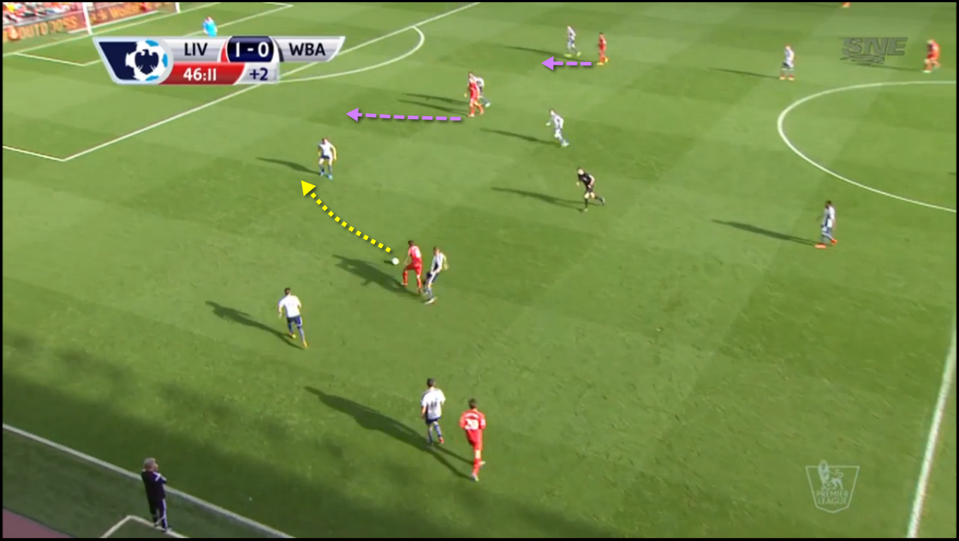
When Lallane got challenged and Lambert (?) drew the gap, you could see Lallana look for Sterling to run into the gap, but with no luck; Sterling just jotted to the centre without appearing to have an eye for the opportunity:

As Lallana got to the point he had to make the pass, Sterling was nowhere near where he could (and should) have been to have a "semi-challenged" one on one with the goal keeper. Now Lallana ran out of room and lost the ball:

As an Everton fan I guess I should be happy with the current state of Sterling, but I am also a football lover, and Sterling during last season made for an exciting watch. For that point of view I hope he quickly finds his form of last year and gets a better understanding with his new team mates. Sure they are no Suarez, but in the case above it was up to himself to make him available to the great run by Lallana. Just don’t do it against Everton.
West Ham goal against Liverpool
With the time of the game and the score in West Ham’s favor already, the ball carrier has plenty of time and space to operate.
He has plenty of options, but the ball carrier is a bit ahead of his support on the left side. The left CB and LB are more concerned with the RW, who is looking for the direct through ball. Even the right CB is pulling a bit left at this point. Liverpool’s RB is far ahead of the West Ham player coming up on him.

The ball carrier moves up further, and slows down allowing for his support on the left to catch up. Liverpool’s RB has not kept up with his man, and is now looking at his right CB to take him. As the RB is not really pressuring the ball carrier he’s not doing anything really.

The pass is ending up to be perfect, be it close to being interceptable. Then the finish is great.

Manchester United playing with 3 defenders after all?
Of course there was (and will be) lots of talk about ManU playing the “normal” 4-4-2 again after the 5-3-2 hadn’t been working well. Knowing that LvG is not a man who likes talking strictly in formation terms (but rather intension of the players, and the goal they have been onto the pitch with) it is still the hot topic: what will he do today?
As the game progressed I couldn’t help but notice that their shape resembled more and more of a three man defence with Blackett and Evans, and Blind (#17) slipping back between the two Centre Backs. To see if that observation was correct I checked with FourFourTwo and WhoScored, and it appears that on average the positioning was leaning towards three (central) defenders with the left and right back operating closer to the midfield. Admittedly this became more obvious while the game was in the bag, but it made me think LvG was playing with the option non-the-less.
It also shows a “5-3-2” can still be very attacking if the intend of the full backs is to provide wing support and crosses, showing more like a 3-5-2 (or as LvG likes to state: 1-3-5-2)

fourfourtwo

whoscored
